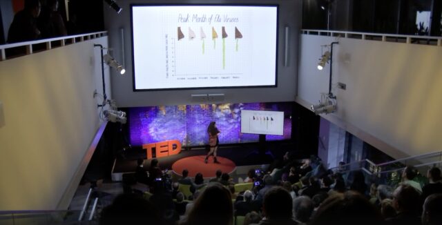
In this goofy TED Talk (https://www.ted.com/speakers/mona_chalabi), Mona Chalabi focuses on finding and questioning the data used to make informed decision. Like a person adrift at sea, surrounded by water and yet perishing for lack of (fresh) water, teachers and administrators are being swamped by data and yet almost frozen in making decisions. The three significant issues she addresses are:
1. Can you see uncertainty?
2. Can I see myself in the data?
3. How were the data collected?
Don’t trust averages which often hide the variation inside them. And have as many people as possible review the data and display.
Effective reports should include both data tables and graphic displays. Clean tables should be presented with titles, orderly columns of statistics and rows of populations or variables, and values that are appropriate. Graphical displays need to reflect excellence and be comprised of interesting data, effective communication of complex ideas, and display “the greatest number of ideas in the shortest time with the least ink in the smallest space” (p. 51). And graphic displays should always include multiple variables and tell the truth (from Edward Tufte ).
In WRN, teachers can access reports for both individuals and groups (who respond to a prompt) by clicking on either of them (left panel below). The image in the middle panel shows an individual’s graph displaying spelling/grammar, entities, key vocabulary, unique words, and total words (with a table presenting values below). In the image on the right panel, the average of two students is displayed for total and unique words [on the left] and average key words in each of the concept buckets [on the right]. In both graphs, a table depicts the actual values.
Moral of this blog: Reports on student outcomes should consider both individuals and groups as well as provide actionable data using both tables and graphs.

